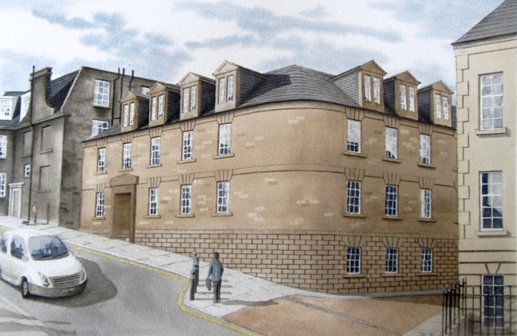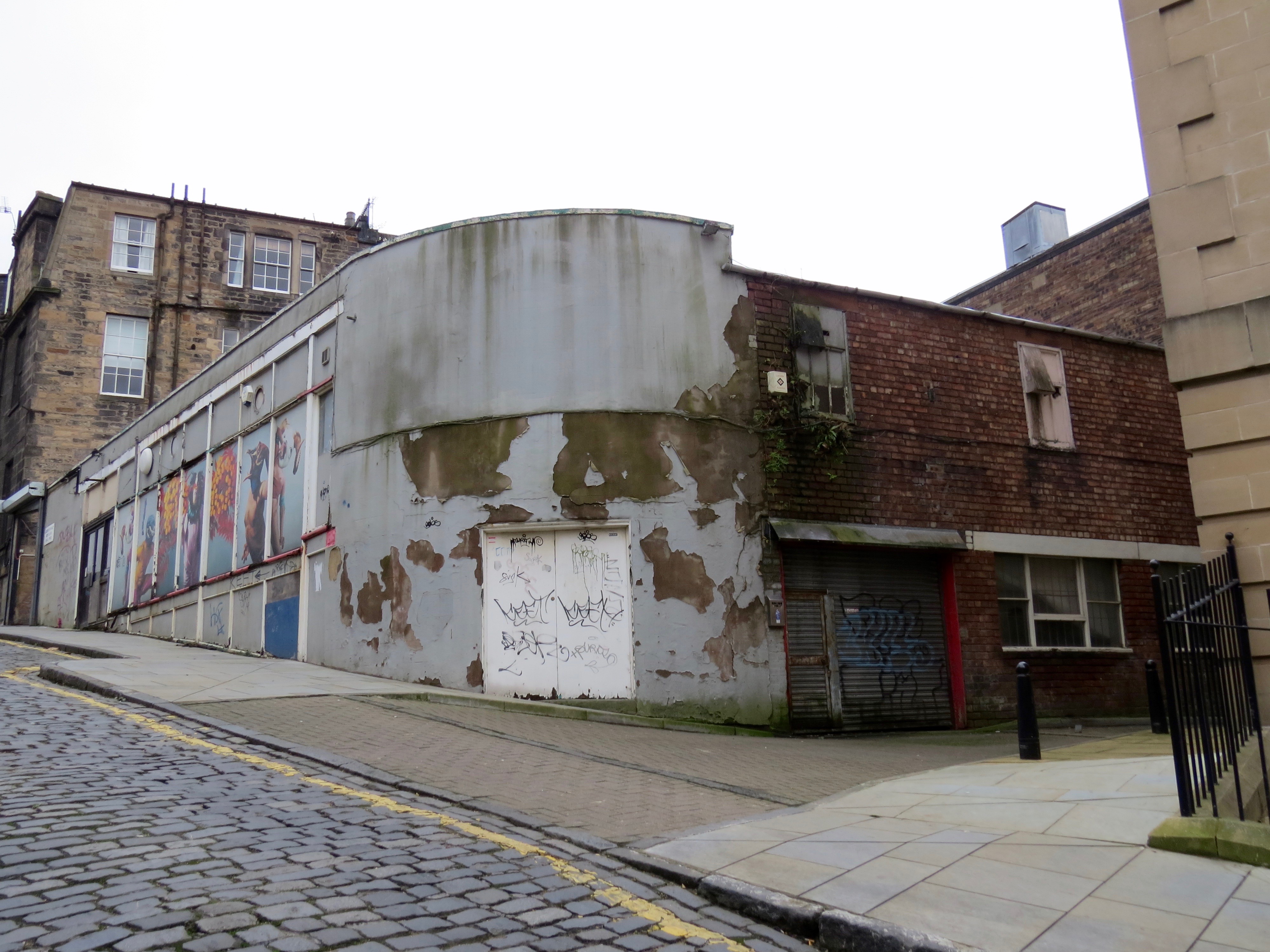
Zonal Retail Data Systems have applied to demolish their semi-derelict building at 14–16 Union Street, formerly a printworks and photography workshop (Ref. 15/05808/CON). The site is in a Conservation Area.
Planning permission already exists to construct a new 3.5-storey office (Ref. 12/02591/FUL). The consented plans are a refinement of those which initially attracted criticism for their 'poor detailing' (Breaking news, 10.8.12). The Cockburn Association and New Town & Broughton Community Council objected.
D2 Architectural Design insist, in unlovely prose, that the new plan:
reflects the style, character, scale and proportion of the architectural merits apparent in the immediate vicinity incorporating the use of similar material finishes. We have proposed the use of a sandstone external wall finish with varied coursing and features typical of the fenestration apparent in the typical Georgian architecture of the area. We have proposed the use of white timber sash and case windows with traditional astragals with the incorporation of Juliette balconies. Conservation style roof windows have also been proposed to the north elevation pitched roof section with a natural slate roofing finish to all pitched roof areas and a single ply membrane to the flat roof section. We have also proposed black metal rainwater goods also to match the existing.
Zonal mean to keep the building’s main entrance on Union Street, whilst creating a link to their existing premises at 24 Forth Street. No new parking is proposed.

They say that expanding their offices will allow the creation of around 50 jobs, and obviate any need to move from the city centre.
However, one of the original conditions of planning consent was that a start should be made on the development within three years. That means there is now considerable pressure to get cracking before 20 February.

*****

This would entail removal of a rear window to form a doorway and door, and the erection of a full-height flue at the back of the building.
Unfortunately, this is the sum total of useful information available online. Not even the application form is available. Spurtle is chasing.
----------------------------------------
 Paul Burgess For once, the new building looks like a huge improvement.
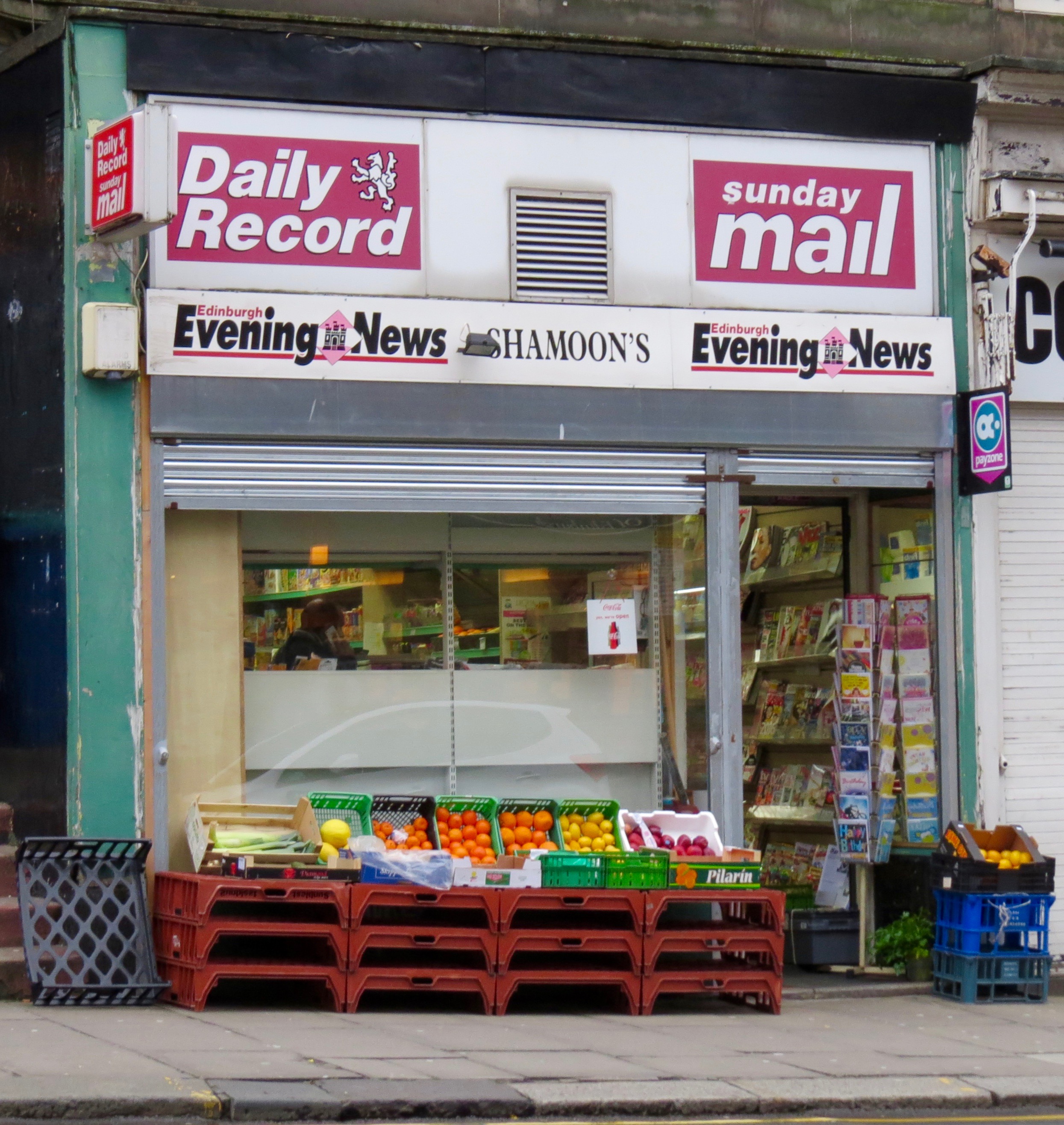
 Paul Burgess Shame to see yet another newsagents / grocers closing though
 Rachel Bell Will miss the murals!
 Alison Sharp Looks fine to me
@theSpurtle Oh God, not that one again. Thought it had been knocked back a couple of years ago? The watercolour is embarrassing too.
@theSpurtle My first impression is favorable. I honestly would like to understand what the opposition dislikes and would prefer.
Critics originally disliked fenestration, proportions & elevations' detailing. Felt was poor pastiche. Developer then modified. @hackonteur
@theSpurtle @hackonteur the roof windows on the northern elevation need to be better aligned with the lower stories.
 Neale Gilhooley That looks like a wonderful improvement to what is currently aging there. So smaller local developers show the grand scheme architects the way.
 Nicole Roberts Looks like a vast improvement.... what's the catch??
 Nikki MacLeod For once s developer is proposing something that fits in beautifully with what's there and is a huge improvement. Hope it gets go ahead. Bloody Council will probably say it's not contemporary enough.
Broughton Spurtle Funnily enough,its lack of contemporaneity was indeed a problem way back at the start (follow the Breaking news link). Not anymore, though, and it already has planning consent.
Nikki MacLeod Glory Hallelulja. They wanted my pal to clad her kitchen extension in cedar rather than stone on a stone built cottage in the Trinity Conservation Area!
@theSpurtle Compared to the empty eyesore there at the moment looks pretty good to me - and I live in the area.
 Marta Mcglynn Craven pastiche! A wonderful site for some really exciting architecture!
 Neale Gilhooley Maybe they are replacing someone's idea of exciting architecture, that ugly graffiti blot.


